The National Beta Club is the largest independent, non-profit, educational youth organization in the nation. For more than 80 years, they have prepared today’s students to become the leaders of tomorrow. They were in need of a website redesign that would appeal to both students and sponsors. To accomplish this, we conducted a usability study which ultimately led to a simple and engaging experience.
Their previous site had some significant issues worth noting. When it came to the information architecture we found that it was too complex and confusing. As a result, this made it very difficult for potential sponsors to start new clubs. They had to first rollover “START A CLUB” in the main navigation, read the on-screen instructions, go to the “ABOUT” pages and read more about Beta Club, follow eight more steps, fill the New Club Application which should then be signed by both the sponsor and the principal, and finally mail it in along with a check.
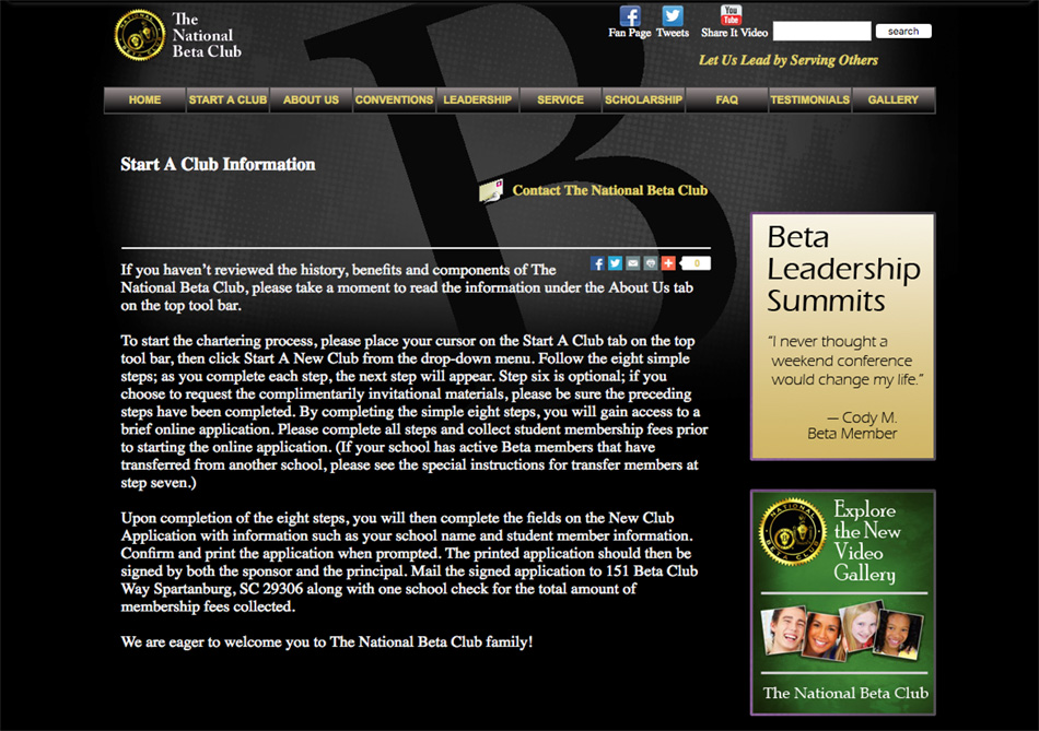
Previous "Start A Club" Subpage.
Another pain point was having to go through a long list of existing clubs in order for them to find a club nearby. Furthermore, the site had no official state pages so state sponsors would often create their own independent sites which created brand inconsistencies.
Although the membership offered great benefits and opportunities, the site wasn't doing a very good job at selling them. The site needed to be visually attractive to members, giving them as much exposure as possible, while at the same time, giving them the ability to connect and feel part of a community. However, the visual design felt dated and lacked the life and energy that characterizes its members. The overwhelming amount of black combined with lack of color photography, gave the site a depressing appearance. Some sections for the site, like the “gallery”, used a completely different template—breaking the flow of the experience.
The site wasn't responsive either, which meant that members and sponsors weren't able to use it effectively on their mobile devices.
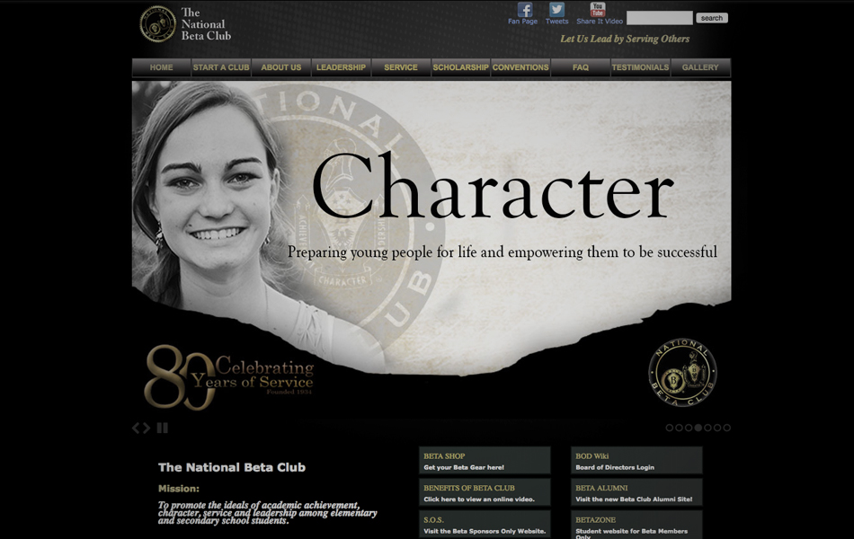
Previous homepage design.
In order to adequately address all these issues with the website, a comprehensive usability study was conducted. The study consisted of group discussions and card sorting exercises. Over 40 participants nationwide participated, including active students as well as sponsors. The group discussion helped define the goals of the website and it's users while the card-sorting exercise allowed us to prioritize the content based on the users' ideal organization.
The goals of the site were to define what Beta Club is, collect donations for the scholarship fund and charity partnerships, and to persuade students/sponsors to join and open new clubs.
Members visiting the site were looking for opportunities like graduation benefits, field trips, travel, meeting famous alumni, and the ability to compete in talent shows. They also wanted exposure such as networking, conventions and graduation benefits.
When visiting the site, sponsors were looking for scholarship opportunities for students, conventions, community service and how it impacts the community, being part of a global network, establishing partnerships with charitable organizations, and results of these conventions.
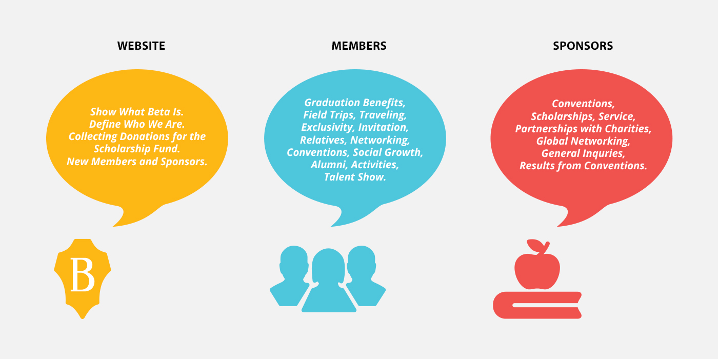
From left to right: goals of the website, goals of members, goals of sponsors.
Based on the card-sorting exercise results we were able to prioritize content of the navigation. The User Researcher employed a card rating system from 1 to 4, 1 being of most importance.
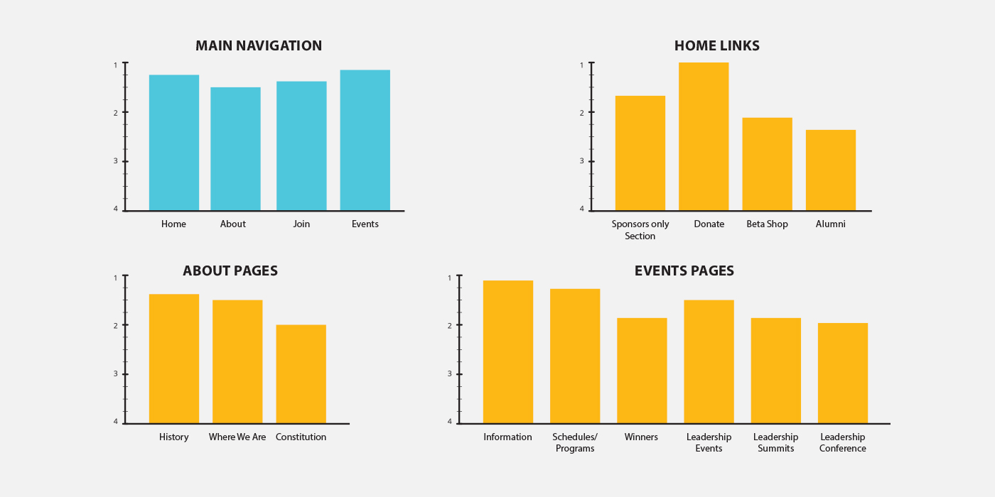
Bar chart that illustrates priotity of navigation.

Card sorting exercise.
When building the sitemap, the Information Architect and I collaborated in balancing the websites goals with that of the users'. Aside from the original sorted menu items, we included additional pages such as a videos page, “Social/photos” page, contact us page, sponsors page, among others.
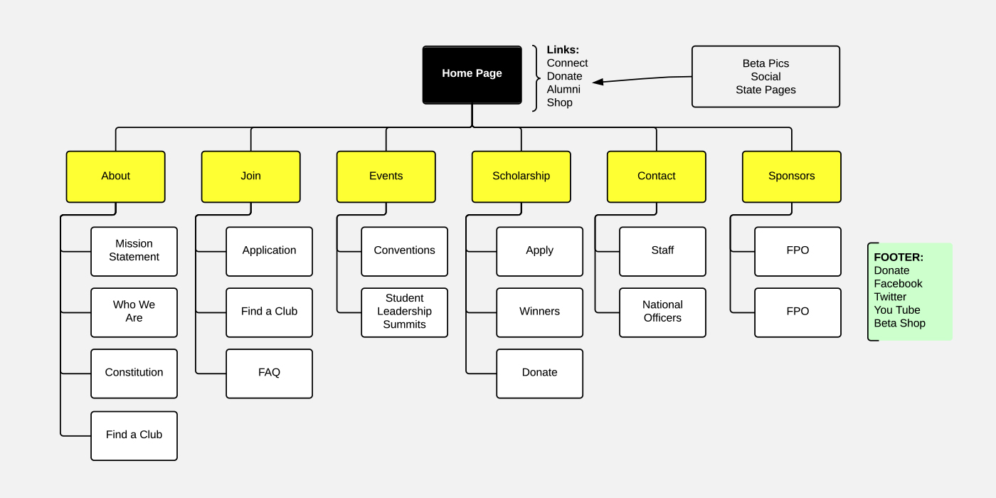
Revised sitemap.
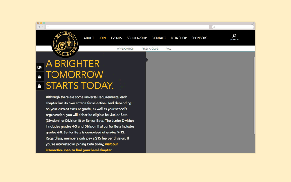
One of the main objectives of the site was to show what National Beta is all about. For this reason I decided to have a homepage slider that would highlight each of the four pillars: Community, Leadership, Academic Achievement. Also, since the organization runs on donations, I wanted to bring that out by adding tabs on the left hand side. These tabs would remain visible throughout the site so that users can easily access them.
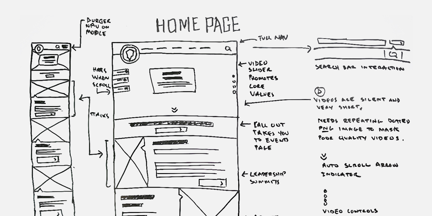
Home page sketch.
By consolidating and prioritizing content we were able to create a more intuitive and fluid experience. For example, if a potential sponsor wanted to start a new club he/she would only have to go to the “Join” page. From there they would access all the information they needed in just a few simple steps.
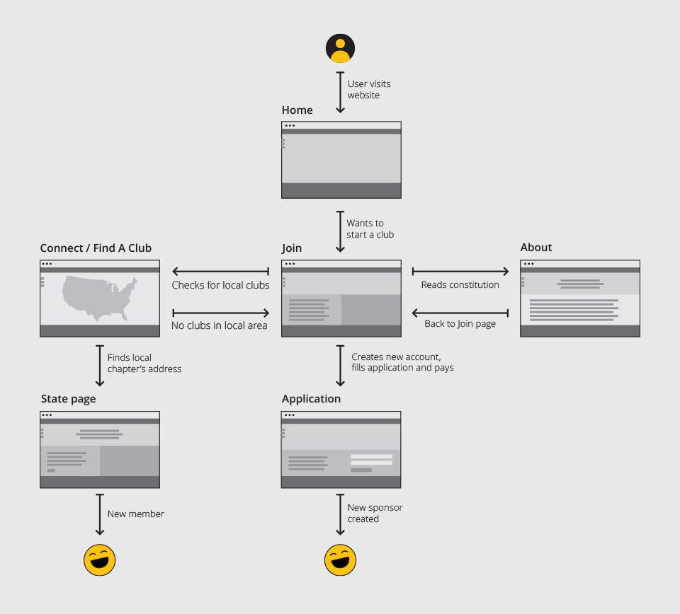
User Flows
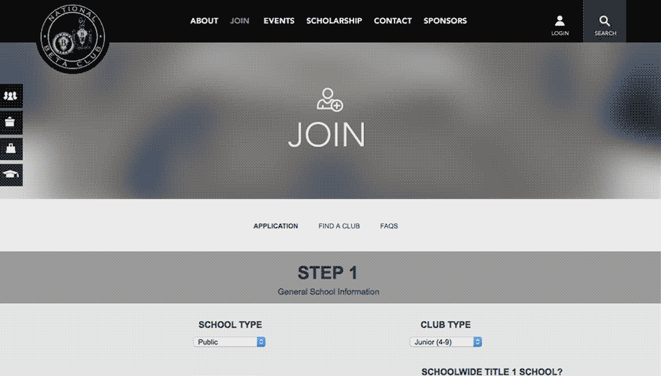
Wireframe that shows how the application process was designed. The application is integral to the site and I wanted to make sure the steps were simple and easy to follow.
Navigation interaction
This was a fun and exciting project to me. It is always very satisfying to hear how your work can make a difference. By building the Beta Club website we were able to help prepare the leaders of tomorrow. We were able to transform a lackluster, and ineffective site into a fun, energetic and engaging experience. Students are now featured center stage, honoring their service to the community, leadership, academic achievement and character–embodying the essence of what it means to be a National Beta member. On the other hand, sponsors and future sponsors alike now have a website that was easy to navigate and find what they’re looking for, quickly and effectively.
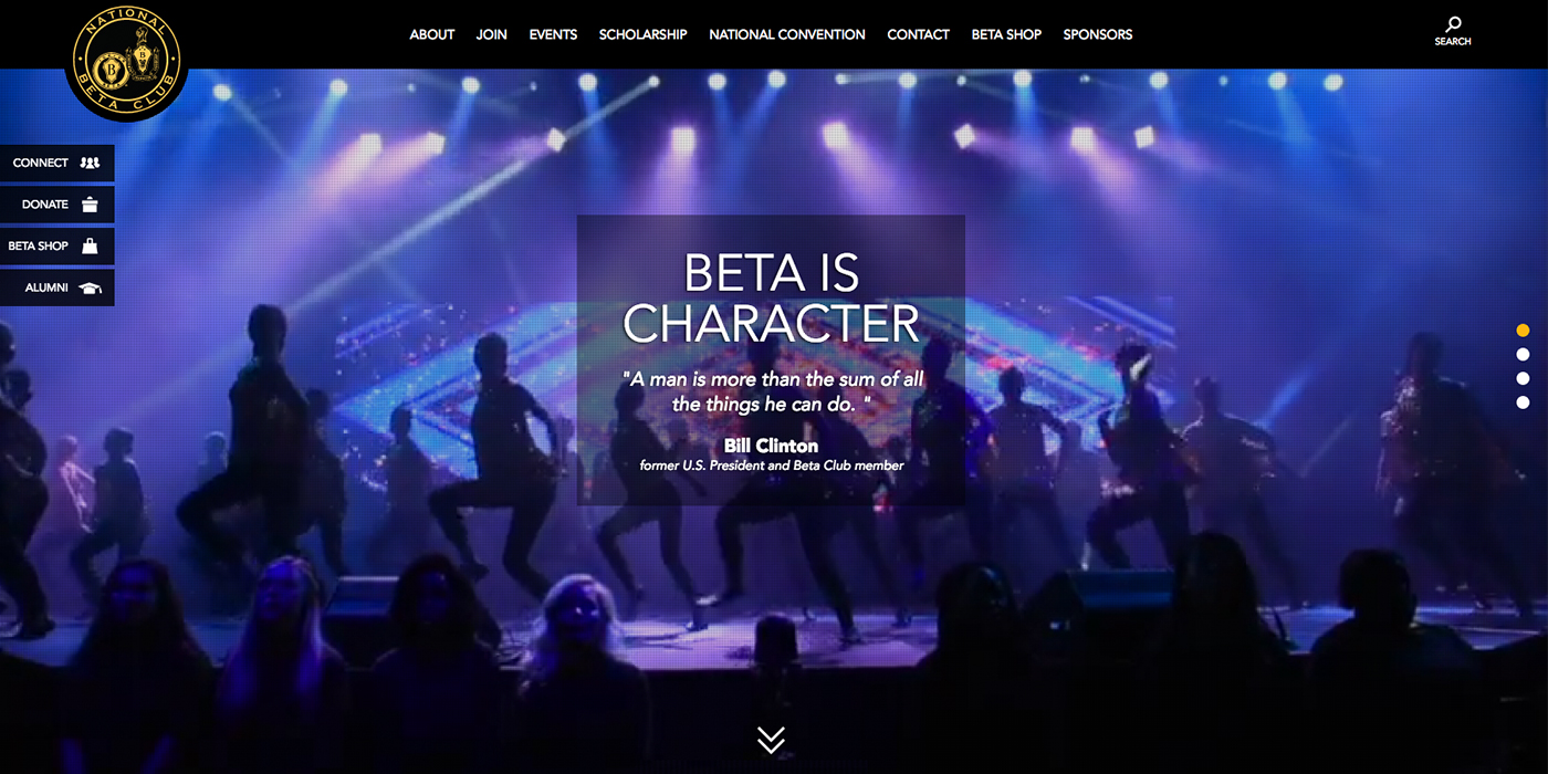
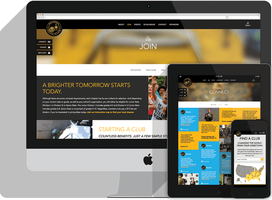
Screenshot of the homepage.
VISIT WEBSITE NEXTDesigned at Jackson Marketing Group.