Michelin Truck Tires needed an app redesign for their Dealer Locator tool. This meant a fresh new look, optimized comprehensive features and widgets, and a brand new experience for both their mobile and desktop users. This responsive app would service truck tire owners and dealers. Furthermore, the app needed a filter function so that users can find out ahead of time what products and services are offered in a given location.
One on the main issues with the Dealer locator was that is was developed for three different platforms: iPhone, Android, and web, which translates to more development time when maintaining it. In addition, the experiences for each of these platforms were very different. Design considerations had to be taken.
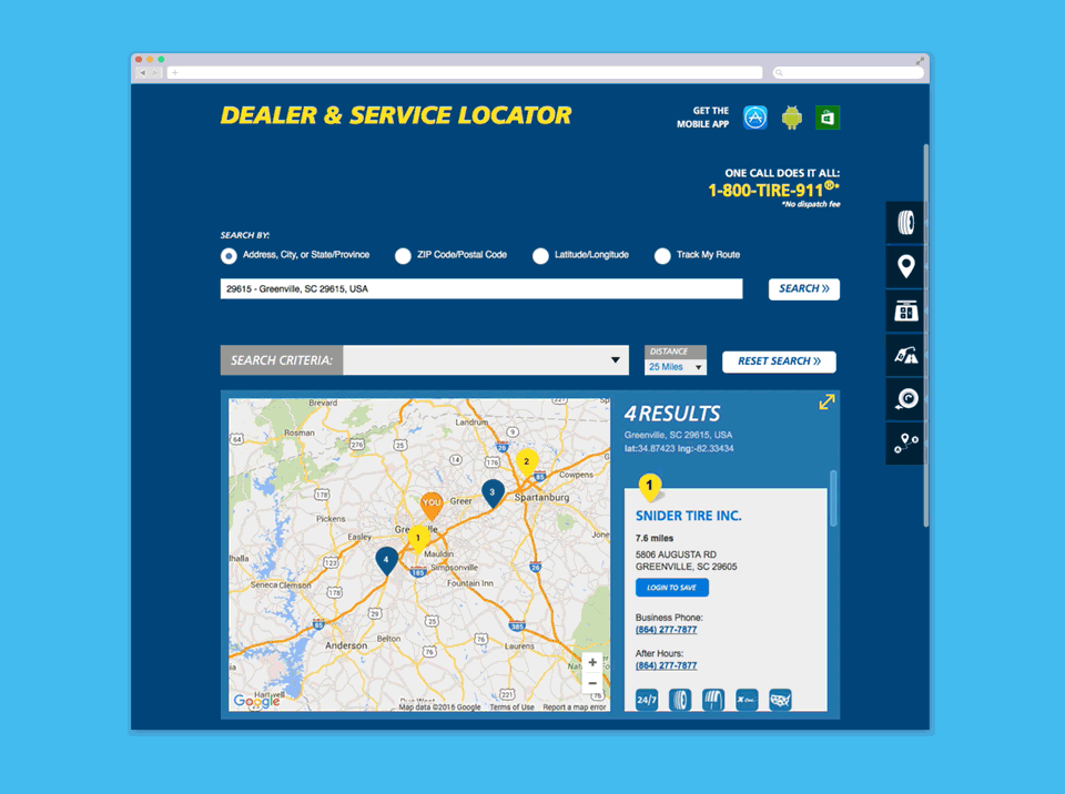
Overall, the app worked well but its functionality was very basic. We needed to add new features to make the app more useful. It needed additional search options such as searching by latitude and longitude, and the ability to track the users’ route. Users would also need to filter by radial distance.
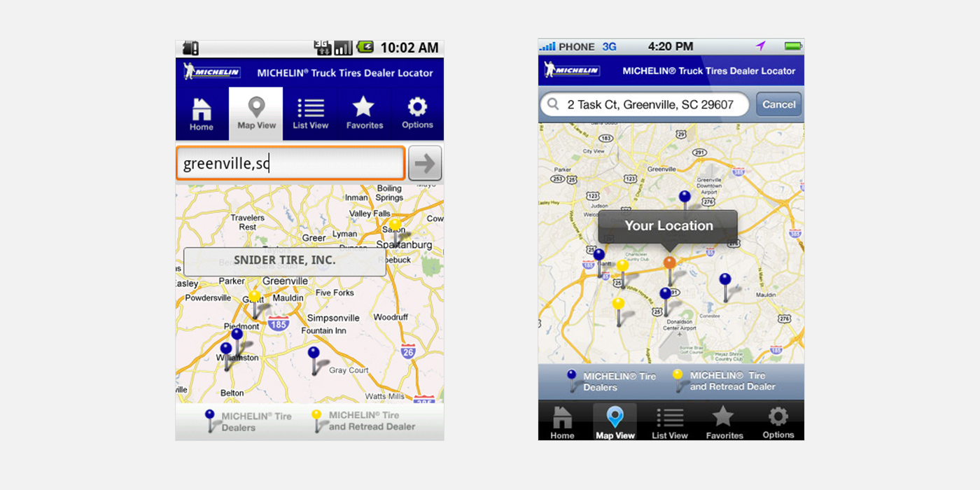
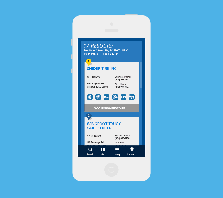
Previous Dealer Locator for Android and iOS app
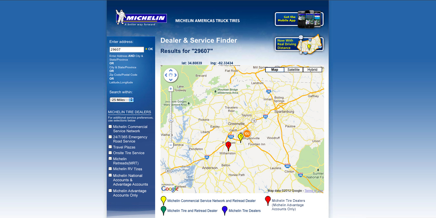
Previous Dealer Locator on the Michelin Truck Tires website.
While having additional functionality in a product is great, from a design standpoint it can be challenging. I had to organize the information in such a way that would still look clean and simple while also considering how it would scale on mobile. I was able to accomplish this by prioritizing the content. I know that the search bar was the most important element of the entire app so I made it wider. This way, no matter what the user searches for, he/she would have enough space to type.
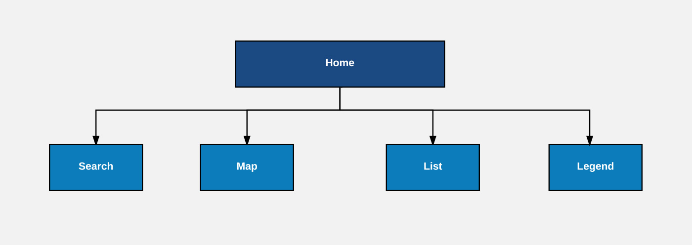
Sitemap.
For the mobile version of the tool, I thought about dividing it into diferent sections, this way users wouldn’t be overwhelmed with information and allowed for more space to work with. These sections would eventually become part of the tab navigation at the bottom of the screen. When a user would search for a particular location, it would jump them to the map section where they can simply tap the pin drop to see each result, or tap the list icon at the bottom for a list view of all the locations.
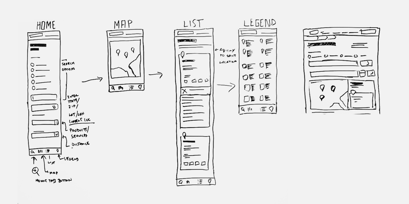
Low-fidelity wireframes.
The icons needed to be simple and recognizable even when reduced to 24x24 pixels.
Dealer Locator Icons.
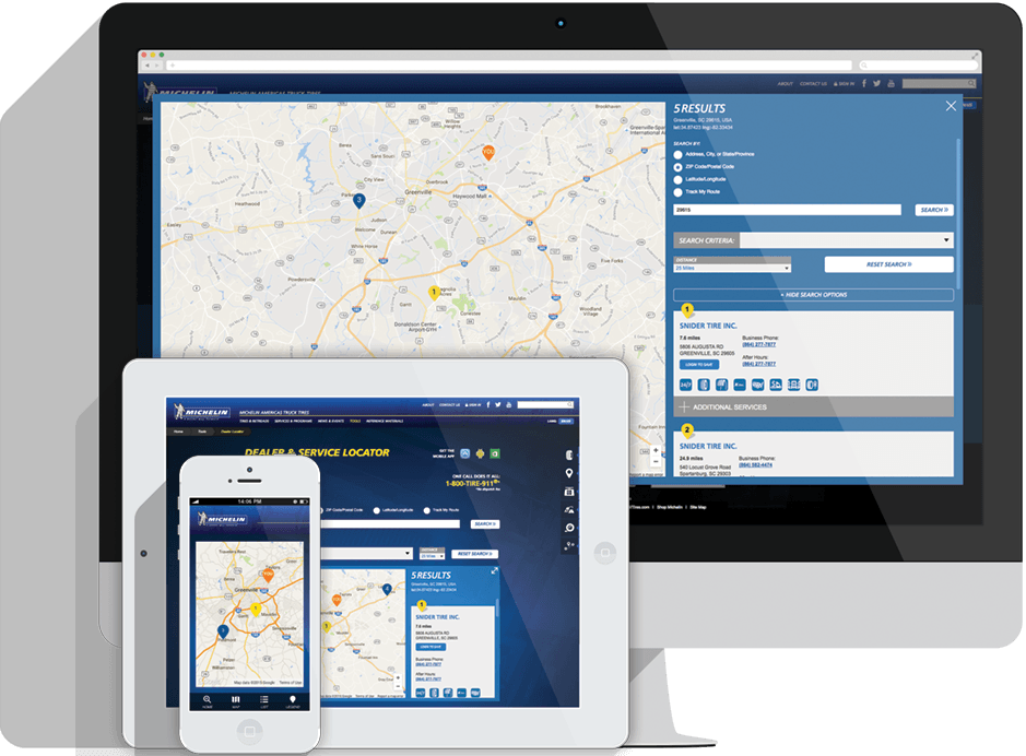
When designing the UI I went with a flat look, which was a relatively new style at the time. A useful interaction was the “Full View” mode on desktops which helped increase the size of the map.
"Full View" feature interaction.
By using a dropdown menu, I was able to hide “Additional Services” under the results list. This interaction helped users scan through the list quicker.
List dropdown interaction.
The new redesign helped minimize development time while creating a consistent visual experience across all platforms. Also, adding a set of new features such as search filters and route tracking really helped truck owners find the right Michelin Truck tire dealer for their needs.
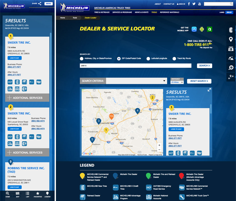
Final design
EXPLORE APP NEXTDesigned at Jackson Marketing Group.